OVERVIEWINITIAL FINDINGSPROBLEM SOLUTIONCOMPETITIVE ANALYSISUNDERSTANDING USERSIDEATIONREFINENEXT STEPSTAKEAWAYS

Relief Route

RESTROOM FINDER AND PLANNER FOR OLDER ADULTS.
jump to solution ↓
ROLE
Product Designer
  • Conducted 3 Competitive Analyses
  • Interviewed 2/8 Users.
  • Created journey maps.
  • Led group ideation, sketching, and wireframing, creating 8/10 screens.  
  • Conducted 2/8 User Tests.
  • Led design revisions.
  • Created visuals & final prototype, following WCAG standards.
TOOLS/SKILLS
User Research
Wireframes
User Testing
Prototyping
Figma
FigJam
CONTEXT
3 Product Designers
School Project
TIMELINE
September - December 2025
OVERVIEW
Relief Route is a navigation-based application designed to help older adults with varying restroom preferences and needs find a preferred restroom in the city.

It allows users to spontaneously find their preferred restrooms whenever the need arises, with ease and without worry.
INITIAL FINDINGS

Toronto's restroom network is seriously lacking.

Restroom access is fundamental to human dignity and crucial for the equity and accessibility of a city. Currently, Toronto’s public restroom network is failing to meet the standard maximum spacing of 500m between restrooms, set by the American Restroom Association.
(Ye, J. (2023, December 8). Public washrooms: The gift that keeps on giving. Spacing Toronto)Toronto's official public restroom network map via Toronto's Park & Recreation ↓
Map of Toronto's public restrooms.
(City of Toronto. (2024, November 6). Park & Recreation Washrooms & drinking water. City of Toronto)

Older adults especially need access to restrooms.

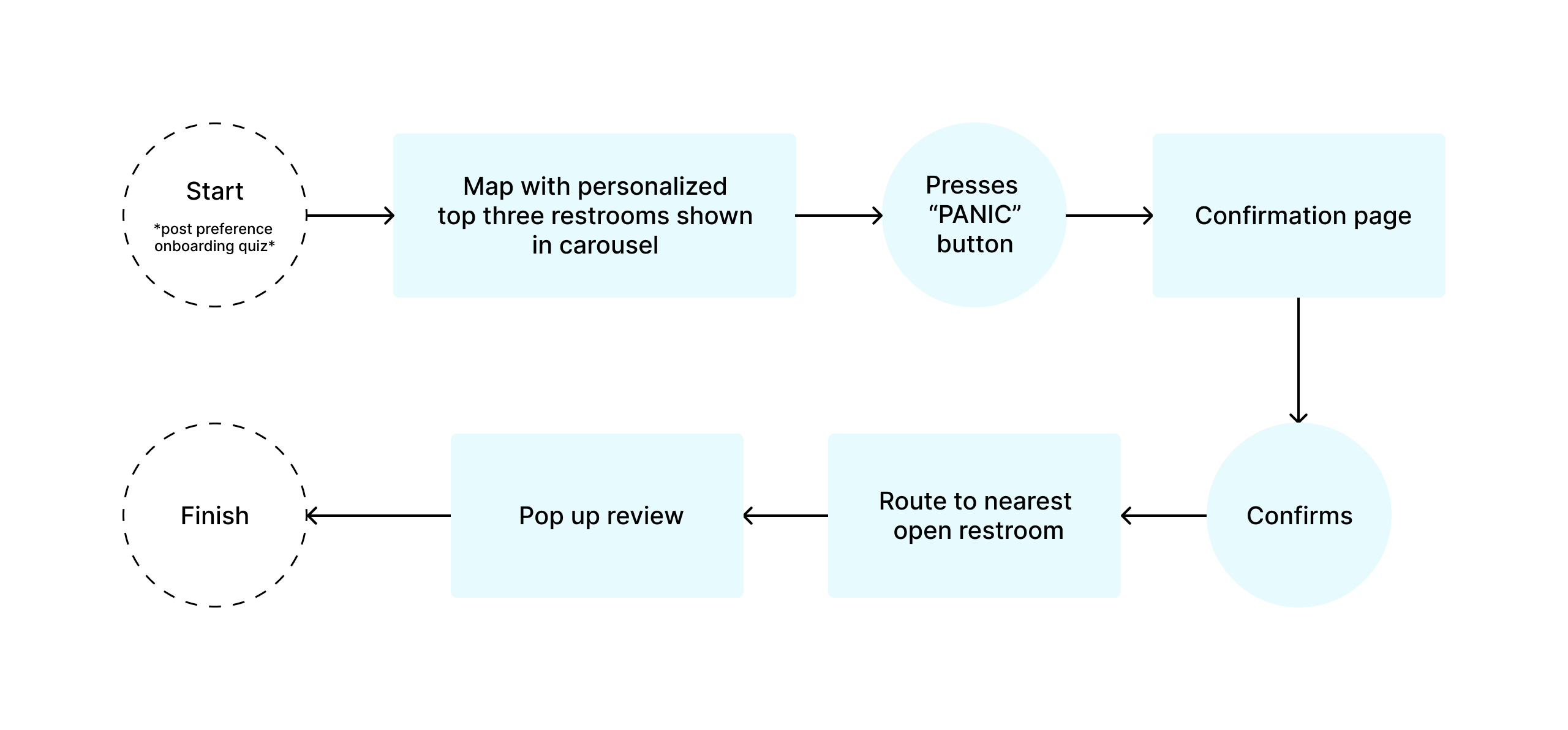
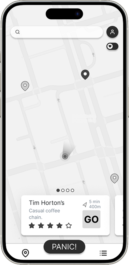
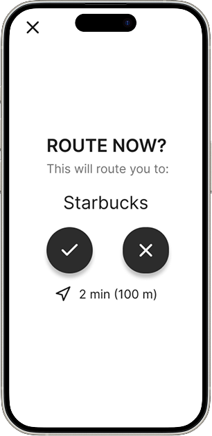
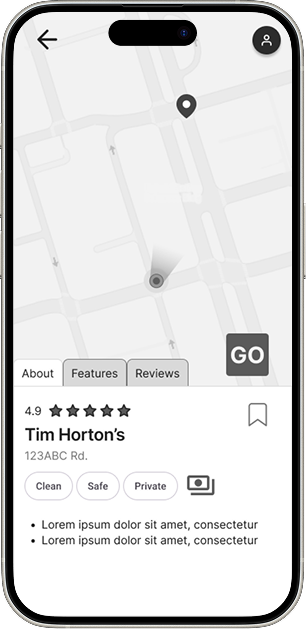
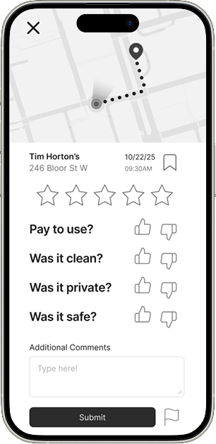
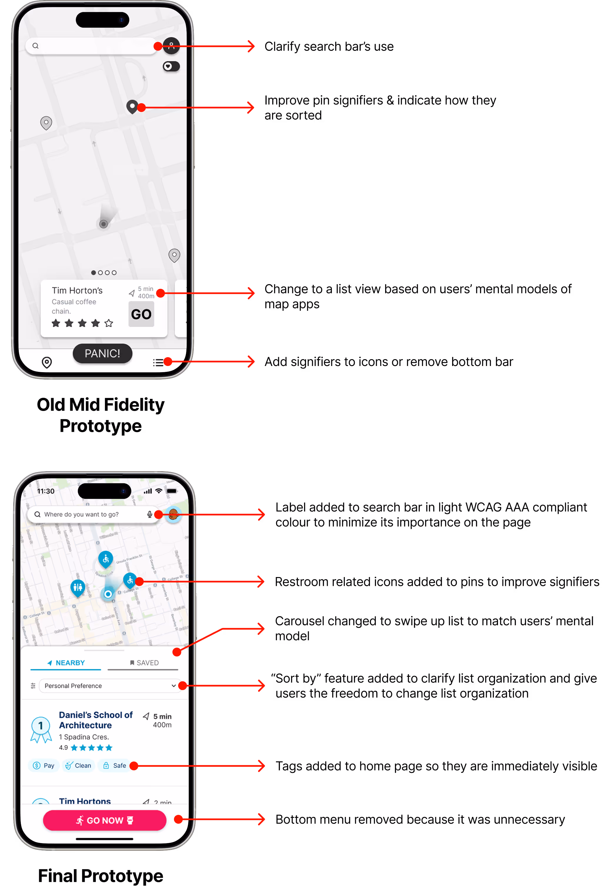
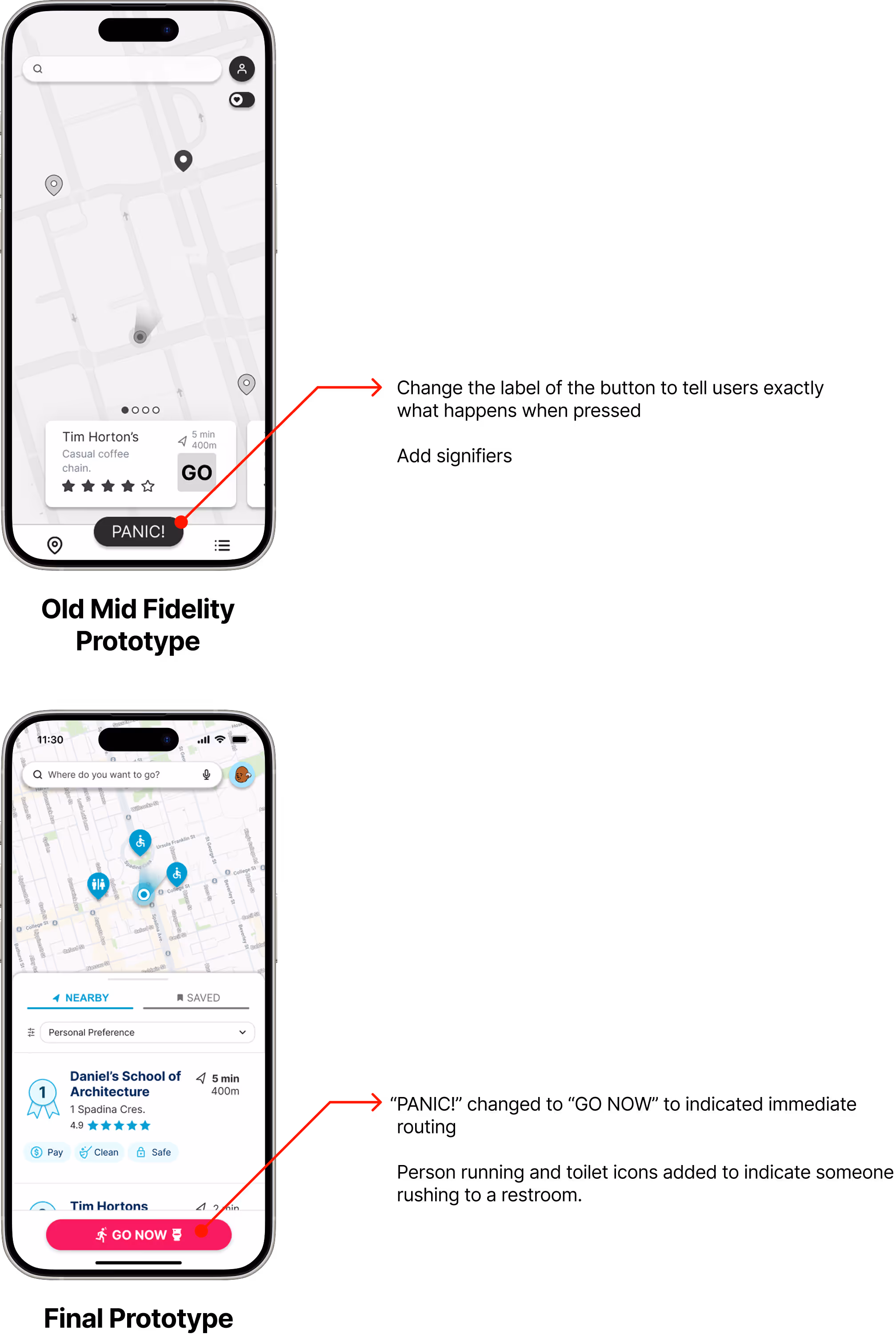
As we age, we are more likely to develop health issues, such as incontinence, that require more frequent and sometimes unpredictable restroom usage.

When it is hard to find restrooms, older adults are more likely to intentionally dehydrate themselves or not leave the house, compromising their physical and social well-being.
(Mayor & Williams, Public toilets: Older people avoid drinking over lack of Loos)
PROBLEM STATEMENT

Older adults in Toronto need a way to locate a suitable restroom so that they can relieve themselves safely and independently.

SOLUTION

A restroom focused mobile navigation application that utilizes user contributions to provide suitable restrooms to users to navigate to.

A simple preference-based and user insight driven delivery.

On the home page, users are first shown their top three restroom in the area. This is so users can make informed decisions simply, quickly, and without stress.

The information is collected through crowdsourced data in the form of reviews.

Emergency routing for when every second counts.

An emergency "GO NOW" feature for when there is no time to make a decision on where to go.

Crowdsouring to keep information up to date.

To provide users with the most up to date information about the restrooms, a pop-up review post restroom visit prompts users to leave a quick review.

Here is how I got to the solution...

COMPETITIVE ANALYSES

Understanding gaps in the market.

I conducted three of the four competitive analyses. In total, we evaluated Google Maps, Toronto's Parks & Recreation Washrooms & Drinking Water Map, GoHere, and AccessNow.

Google Maps did not have tailored information, and other restroom-focused apps were limited and cluttered with unreliable information.  
Google Maps
Check mark
Powerful & ubiquitous tool
"x" mark
Overwhelming & inconsistent information
"x" mark
Not restroom-focused
Toronto's Map
Check mark
Kept up to date by the government
"x" mark
Only shows the city's restrooms
"x" mark
Extremely limited restroom network
GoHere
Check mark
Restroom-focused UI
Check mark
Restrooms pinned along route
Check mark
Business collaboration
"x" mark
Outdated information
AccessNow
Check mark
Strong focus on accessibility
"x" mark
Text-heavy & hard to scan quickly
UNDERSTANDING USERS

Interviewing older adults about a sensitive but important subject.

I interviewed 2 out of total 8 older adults to understand their pain points. We wanted to know older adults' struggles in currently finding restrooms and what makes them want/not want to use a restroom when finding one.  

We chose familiar interviewees for convenience and sensitivity. I ensured they felt comfortable by emphasizing that their participation was voluntary, anonymous, and could be withdrawn at any time.

“When I urgently need a restroom, I panic...I’m always scanning.”- Interviewee P05

“Like I just cannot hold my myself like it runs and it's it's awful when you have that kind of accident... I feel like I almost cry of I'm not making it.”
- Interviewee P07

INSIGHTS

From analyzing the interviews, several key insights emerged.

Reliance on memory is a burden.
  • Participants stay in familiar areas and rely on mental maps because it is hard to find new restrooms.
Emergencies have increased with age
  • Health-related needs, such as incontinence, have arisen with age.
  • Unpredictable accidents are embarrassing and add stress to travel.
There are
many barriers to restrooms.
  • Barriers to restrooms include:
  • Necessary purchases
  • Broken facilities
  • Unexpected
    closures
  • Busy facilities
Hygiene and safety are of top concern.
  • Restrooms need to be clean to be usable.
  • There are concerns about unsafe individuals in restrooms.
PRIMARY USER PERSONA

Designing for an older adult's wants and needs.

Taking the insights from our user interviews, we prioritized supporting older adults who have strong restroom preferences but also face unpredictable restroom emergencies.

Nervous Nancy

COMMUTES 2-3x A WEEK FROM THE SUBURBS | INCREASED URINARY FREQUENCY POST-MENOPAUSE | AGE 59
Goals
  • Feel safe and confident when she travels into the city
  • Maintain regular work attendance and professional independence
Frustrations
  • Really does not trust TTC or Toronto's public restrooms.
  • Highly dislikes finding a dirty or unsafe-feeling restroom.
  • Has to use the restroom at multiple points along her commute

Journeying John

DAILY TTC COMMUTER | UNPREDICTABLE GASTROINTESTINAL ISSUES | AGE 62
Goals
  • Travel on the TTC without relying on their restrooms
  • Freely explore Toronto to enjoy all the city has to offer.
Frustrations
  • Struggles to find a restroom when a sudden urgency emerges.
  • Terrified of a sudden accident occuring while commuting or while in an unfamiliar area
OUR VISION

The initial prototype prioritizes personalized restroom insights through user contributions and emergency routing.

We wanted to create a streamlined way for users to find restrooms that fit their wants and needs and an emergency option for when every second counts.
PREFERENCED-BASED SELECTION FLOW
EMERGENCY ROUTING FLOW
MID-FIDELITY WIREFRAMES

From the task flows, the mid-fidelity wireframes were created.

I led the creation of and created 8 out of the 10 mid-fidelity wireframes.
USER TESTING & FINAL PROTOTYPE

After creating our mid-fidelity wireframes, 8 user tests were conducted to get user feedback.

I led the writing of the user testing script and conducted 2 of the 8 user tests. I then created the final prototype and revisions from user and expert feedback.

Simplified vs. Too Simple

In our aim to make it simple and quick to use compared to other cluttered map UIs, we oversimplified and did not account for users' existing mental models and have enough signifiers.

I changed the organization to a list view to match users' mental models and added signifiers to the restroom icons. 

Panic Button caused Panic!

The "PANIC!" button's label unintentionally and ironically caused anxiety among users. Initially named during brainstorming, the label confused users about its function, making them hesitant to use it.

I changed the label to "GO NOW" to better signify what would happen if pressed and increased its size in the thumb zone of the device.

Panic Confirmation & User Freedom

After receiving expert and user feedback, I decided that the confirmation page needs to keep users oriented in their location and still have the freedom to quickly skip to another option.

Reluctant Reviews & Reports

Reporting issues and the save feature were totally lost on older users, so I added the reporting to the quick questionnaire and improved the signifier for the save feature.

Testing also revealed that users were hesitant to leave reviews, as they didn't perceive any personal benefit. Future features could enhance incentives for leaving reviews, such as points for reviews that could go towards deals with businesses.
NEXT STEPS

What can be done next?

Real-World Testing
Due to time constraints on the project, testing on a phone in a real environment could not be done for our user testing.

In order to account for environment-related distractions and effects on the product use, safe testing in a real environment on a phone with older adults should be done.
ALTERNATIVE USER PERSONA

Designing for parents with young children.

While "Relief Route" is currently geared towards older adults, the platform's design can expand to consider more target users that would find great use in the app.

Potty Training Patricia

WALKS OR RELIES ON TTC | POTTY TRAINING HER 2-YEAR-OLD
Goals
  • Attend to different events around the city with her family.
  • Wean her toddler off of diapers by making her use the toilet.
Frustrations
  • Struggles finding a restroom that is accessible for her stroller.
  • When her toddler has to go, she has to go! There is no time to think and she has to go to a restroom immediately.
FUTURE FEATURES

How can Relief Route grow?  

Business Collaboration and Expansion
Business collaboration with the platform could expand the restroom network, add another way to keep restroom information up to date, and generate revenue.

Many users revealed during interviews that they did not mind purchasing something at a cafe to use a restroom if it meant access to a suitable restroom. Relief Route could drive users to establishments and incentivize the collaboration.
Incentives through Points & Rewards
A points system for reviews could be added as a part of future business collaborations. In user testing, it was discovered that users were reluctant to leave reviews because they felt that it did not benefit them. Through this system, users could feel rewarded and incentivized for leaving reviews.  
TAKEAWAYS

What I learned from my first product design project! ⋆.˚˖࿔

Simplicity needs Clarity
In an attempt to reduce users' cognitive loads, we tried to keep the UI as stripped down as possible. In user testing we found that by not including signifiers, many functions were not clear.

I learned that just because a design is simple, it does not mean that it is understandable. Good design needs clarity.
Understanding Different Mental Models
When designing for older adults, functions and symbols that I had assumed were universally understood were not by our target demographic.

Moving forward, I learned to not make assumptions about different users' mental models and to always strive for understanding and clarity.

Next Project → ⋆.𐙚 ̊

Architecture Internship Finder →

web design
full process

More Selected Works → ₊˚⊹♡